Pagina's

donderdag 24 januari 2013

Poster design: Ginsert

4th year graphic design, assignment for the city "Genk".
A while ago I was offered an graphic design assignment for the youth department of my home city, Genk. I made a look & feel for them and designed an announcement poster for an event in the youth centre. Now they asked me to make a new announcement poster for the youth centre, based on the one I made earlier. You can see the result in the picture below and in the busses of Genk. I'll show you the two versions I made, from which one will be chosen.


© All rights reserved, Sara Nysten
These images and ideas are copyrighted by Sara Nysten. You can't use them.

Colouring book: Creative colouring for people with dementia

4th year graphic design, assignment for a subject called "social spaces".
For this assignment we had to design something for people with dementia in 2 months. We had to make something that would make the lives of people with dementia a little bit brighter, even if it were something very small. Throughout the two months we had to spend two days (and a night) at an dementia department, interact with people with dementia and research about the subject.
I choose to make something specifically for my grandfather, who suffers from dementia and spends his free time colouring. The problem we encountered is that there aren't any colouring books available for people with dementia. Even though people with dementia like to colour and aren't satisfied with a children's colouring book.

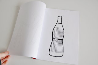
So I decided to make a colouring book for people with dementia as my project. I researched about the specific needs and desires that people with dementia have considering with a colouring book.The drawings had to be simple but not childish, they had to be recognizable and not abstract, the pages shouldn't be too big because people with dementia have a short attention span and it can be frustrating to not be able to finish the drawing, the lines needed to be thick because it can be frustrating if they keep colouring outside of the lines,... etc.
As you can see there were a lot of things I had to keep into account while making a colouring book.

Another thing I put a lot of effort in was the subjects of the colouring pages. I wanted te colouring pages to have subjects that the people could recognize from their youth. Next I also wanted that the subjects were relatable to the country I'm from, Belgium. So for example: I could make an colouring page of an old car, but that wouldn't be an american car. Because, even if it's from the right period in time, it wouldn't have driven here in belgium. So I'd only focus myself on cars that drove around in belgium back in the old days.

As you can see in the pictures I made two versions of the colouring book. The "Vrij kleuren" is the version of the colouring book that we all know, having white/black pages. In the other version "Kleur suggestie" has the same images but a little bit of colour is already added to teh drawing. This would make it easy for the person to know which colour he has to use, you can compare it a bit with painting with numbers. I made two versions because I can imagine that for some people the "vrij kleuren" is more appropiate and for others the "kleur suggestie" would be better.

I choose to give the book a retro design, which links back to the people their past. I also binded my book with fabric-tape, the way the binded little sketchbooks back in the old days. The pages are glued in the book and are easy to rip out (like in a drawing pad)

If I were to really use commercialize the colouring books there would be a lot theme's available. That way the family member or nurse can choose subjects that lean towards the person his interests. A few examples of possible theme's would be: The seasons, holdidays, spare time, hobby's, food and drinks, nature, cycle of life,... and lots more.

I was very happy with the result and I'm very eager about this project. I think it has a lot of potential since there are a lot of people out there looking for a colouring book for their grandpa, like me. And it made me very happy that my colouring book was of use for my grandpa. Even though it was just one book with 16 drawings, it really meant a lot to me that he enjoyed it.


© All rights reserved, Sara Nysten
These images and ideas are copyrighted by Sara Nysten. You can't use them.

donderdag 20 december 2012

Illustration: Making pastries

4th year graphic design, assignment for my "social spaces" class.
For this assignment we need to design something for people with dementia. But first we have to experience their everyday life. So me and and another student are going to a person with dementia and we prepared some activities for the afternoon. For the pastry-making activity I needed to make a visual instruction sheet. I liked the icons I made for it, so I played around with them and created the sheet below. I decided to upload it here for fun.


© All rights reserved, Sara Nysten
These images and ideas are copyrighted by Sara Nysten. You can't use them.

maandag 8 oktober 2012

Poster design & Advertising: Khlim off/Ginsert


3th & 4th year graphic design, assignment for the city "Genk".
A while ago I was offered an graphic design assignment for the youth department of my home city, Genk. Of course I immediately took this opportunity, since it's my first time doing an assignment for third parties, not related to school. They were going to host a youth project and need some poster and sticker material for it. Every year one of the schools of Genk, called Khlim, hosts a party for it's students to celebrate the start of the school year. Normally this party takes place in Diepenbeek, but this year it was moved towards Genk. So the people of the youth department of Genk were planning to let some busses ride off and on from Diepenbeek towards Genk. This to get all the partygoers easily towards the party and back, with an extra buss-line. 

But they wanted to decorate those party-busses a bit, so they asked me to make some posters and stickers for the busses. The posters were going to be hung inside the busses and the stickers were going to be pasted at the front of the busses. All posters and stickers were going to have a different subject.,When I was designing all that material, I also needed to design a brand identity for the youth department of Genk. A look&feel, in which they could decorate their posters in the future, and a logo of some sort.

Unfortunately the project was cancelled. Even so, the work I did wasn't in vain because now we were closer to a logo and look&feel for the youth department. They asked me to make a totally new announcement poster for an event of the youth centre, with the look& feel we decided upon. This poster was approved and now visible in the streets of Genk. Below you can see all the material and works in progress of this assignment.




dinsdag 11 september 2012

Illustration: Genk

3th & 4th year graphic design, assignment for the city "Genk".
A week ago I was offered an graphic design assignment for my home city, Genk. Of course I immediately took this opportunity, since it's my first time doing an assignment for third parties, not related to school. They needed some poster and sticker material for a youth project. I'm not going into detail here since i'll post the real material and assignment description later on. The illustrations shown here, are example illustrations I made. I wanted to show them in which directions they could go with their posters, and what's better then an image? I didn't use any of these illustrations in the final material. But I thought they were nice, so I decided to upload them too. You probably wonder what the mine building is doing on the images. Well, Genk is famous for his mine and it has become a symbol for the city. This explains why I used it in my illustrations.


© All rights reserved, Sara Nysten
These images and ideas are copyrighted by Sara Nysten. You can't use them.

zondag 2 september 2012

Character designs: mad hatters

3th & 4th year graphic design, spare time.
I'm a very big fan of the company momiji. In short, it's a company that makes cute little dolls. And I saw they had a "submit designs" button on their website. So I took my chance and designed a series of dolls. I gave them very bright colours, and every one of them has a funny hat. Because of this last thing, I called my series "the mad hatters". Unfortunately momiji already had all their doll series planned for the coming year. But they said they were gonna save my contact information, for when they need someone. I guess that's better then nothing. Anyway, take a look at the designs! I made two different types of the series based on feedback I received from friends. I couldn't decide which was better so I decided to post both.


© All rights reserved, Sara Nysten
These images and ideas are copyrighted by Sara Nysten. You can't use them.

dinsdag 28 augustus 2012

Poster design: 3D paper world

3th & 4th year graphic design, internship assignment
My internship company was working on a poster shop. So they are planning to make some appealing poster and sell those in a shop. They asked me to design some posters for them. This resulted in some funny poster designs. My internship teacher found one of the poster designs very appealing and said I could try to reconstruct it with paper and real objects. Doing so would result in an setting with a lot of depth from which I could make a fun picture. I could even make the picture into a 3D image which you can watch with 3D-glasses. And so I did!


I first made all the different objects and next I hung them on a construction above the setting. I did so with pieces of fishing wire which I nodded around the wooden construction above. It took some days before I had the setting like I wanted it too, because rearranging the objects and hanging them backwards or higher etc. took ages. Eventually I took some nice pictures of it.


And next I took some pictures which I edited in photoshop and made into a 3D image. I thought this was a great project since I've never done anything like this before. And now I have more knowledge about these sort of things which I can use in my further life!

© All rights reserved, Sara Nysten
These images and ideas are copyrighted by Sara Nysten. You can't use them.